Creating a Dynamic CSS Color Palette for both Light and Dark Modes
by Hexagon, 4 minutes read css lumocs css-tricks html5
Today, I have an exciting CSS trick to share. When working on Lumocs, I wanted users to be able to set a color of their choice and have the page automatically adapt to that color. I had the idea of using CSS variables to achieve this. Lumocs supports both light and dark modes, so this had to be automatic as well. After some tinkering, I discovered a technique that enables you to generate a full color palette using any hue for both light and dark modes using only CSS.
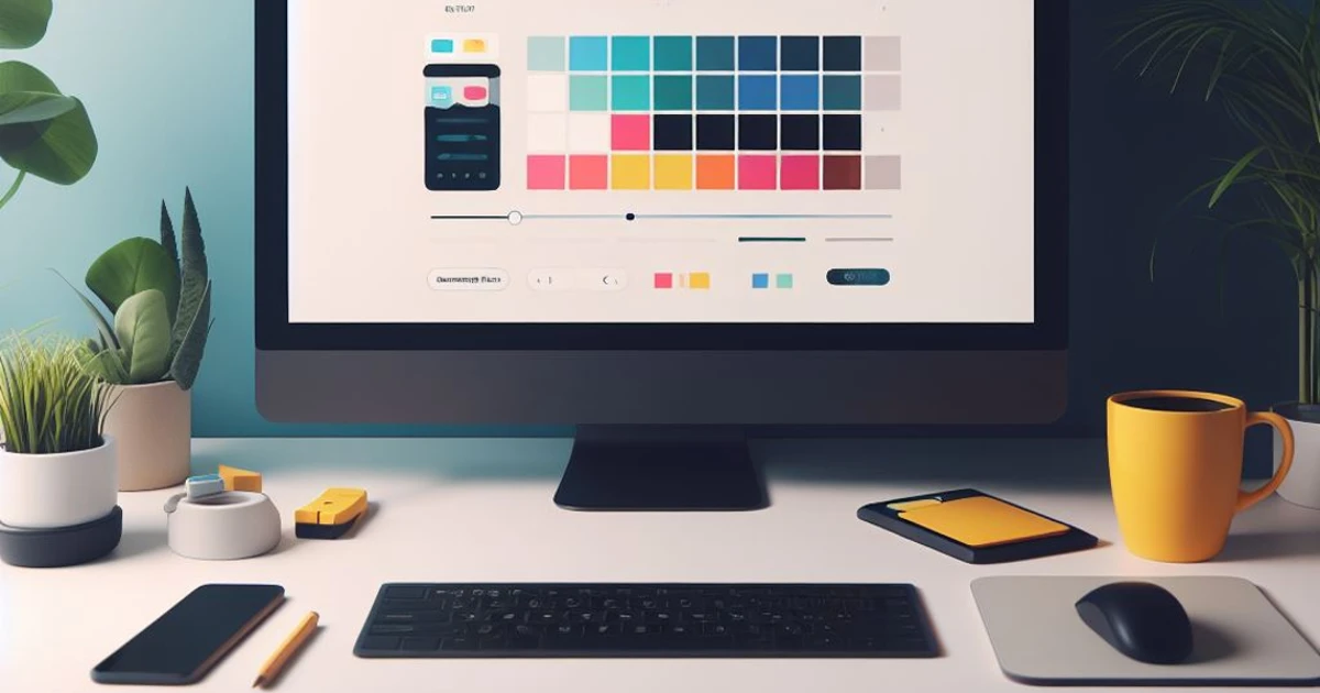
This technique uses CSS variables and the HSL color model to create a dynamic color palette. It automatically adjusts the color scheme based on a selected set of Hue, Saturation, and Lightness. To see a live demo, try the slider at lumocs.56k.guru/usage/customization/. You can also click on the sun/moon in the header to switch between light mode and dark mode. All colors are generated by the technique described below.
Let's get started:
Defining The Palette
First off, we wan't to define the basic HSL-values as css variables:
:root {
  /**
   * Customize theme color by changing Hue, Saturation and Lightness
   * - Lightness should always be around 50%
   *   to allow the same base color for dark and light themes
   */
  --primary-h: 192;
  --primary-s: 100%;
  --primary-l: 57%; /*  */
}
This technique gives you full control over your color palette, allowing you to
change the hue, saturation, and lightness to create a theme that suits your
brand and style. Simply modify the --primary-h, --primary-s, and
--primary-l variables to achieve the desired colors.
Creating the color-variables for both Light and Dark modes
Now we create variations of the base color by inserting our chosen Hue,
Saturation, and Lightness variables into the hsl() CSS function using var(),
and in some cases, modifying the value using calc().
We are creating one __dark and one __light alternative:
- --fg: Foreground color
- --fg-shaded: Slightly shaded foreground color
- --bg: Background color
- --bg-shaded: Slightly shaded background color
- --bg-shaded-2: Even more shaded background color
- --primary: Primary theme color
- --primary-highlight: Highlight color
:root {
  /* Color Palette for light mode */
  --fg__light: hsl(var(--primary-h), 1%, 2%);
  --fg-shaded__light: hsl(var(--primary-h), 1%, 10%);
  --bg__light: hsl(var(--primary-h), 15%, 100%);
  --bg-shaded__light: hsl(var(--primary-h), 15%, 93%);
  --bg-shaded-2__light: hsl(var(--primary-h), 15%, 88%);
  --primary__light: hsl(
    var(--primary-h),
    calc(var(--primary-s) + 20%),
    calc(var(--primary-l) - 20%)
  );
  --primary-highlight__light: hsl(
    var(--primary-h),
    calc(var(--primary-s) + 20%),
    calc(var(--primary-l) - 15%)
  );

  /* Color Palette for dark mode */
  --fg__dark: hsl(var(--primary-h), 1%, 99%);
  --fg-shaded__dark: hsl(var(--primary-h), 1%, 98%);
  --bg__dark: hsl(var(--primary-h), 3%, 12%);
  --bg-shaded__dark: hsl(var(--primary-h), 3%, 10%);
  --bg-shaded-2__dark: hsl(var(--primary-h), 3%, 8%);
  --primary__dark: hsl(
    var(--primary-h),
    var(--primary-s),
    calc(var(--primary-l))
  );
  --primary-highlight__dark: hsl(
    var(--primary-h),
    var(--primary-s),
    calc(var(--primary-l) + 10%)
  );
}
Selecting Light or Dark Mode
Now, we need to select the right variant of __light or __dark. The following
CSS transfers the correct variable, e.g., --fg__dark to --fg, depending on
the user's preference or selected theme:
/* Light mode - Automatically enabled if the user has a light mode system setting  */
:root {
  --fg: var(--fg__light);
  --fg-shaded: var(--fg-shaded__light);
  --fg-shaded-inv: var(--fg-shaded__dark);
  --bg: var(--bg__light);
  --bg-shaded: var(--bg-shaded__light);
  --bg-shaded-2: var(--bg-shaded-2__light);
  --bg-shaded-inv: var(--bg-shaded__dark);
  --primary: var(--primary__light);
  --primary-highlight: var(--primary-highlight__light);
}

/* Dark mode - Automatically enabled if the user has a dark mode system setting  */
@media only screen and (prefers-color-scheme: dark) {
  :root:not([data-theme]) {
    --fg: var(--fg__dark);
    --fg-shaded: var(--fg-shaded__dark);
    --fg-shaded-inv: var(--fg-shaded__light);
    --bg: var(--bg__dark);
    --bg-shaded: var(--bg-shaded__dark);
    --bg-shaded-2: var(--bg-shaded-2__dark);
    --bg-shaded-inv: var(--bg-shaded__light);
    --primary: var(--primary__dark);
    --primary-highlight: var(--primary-highlight__dark);
  }
}
/* Light mode override - Enabled if data-theme is set to "dark" */
[data-theme="light"],
:root:not([data-theme="dark"]) {
  --fg: var(--fg__light);
  --fg-shaded: var(--fg-shaded__light);
  --fg-shaded-inv: var(--fg-shaded__dark);
  --bg: var(--bg__light);
  --bg-shaded: var(--bg-shaded__light);
  --bg-shaded-2: var(--bg-shaded-2__light);
  --bg-shaded-inv: var(--bg-shaded__dark);
  --primary: var(--primary__light);
  --primary-highlight: var(--primary-highlight__light);
}

/* Dark mode override - Enabled if data-theme is set to "dark" */
[data-theme="dark"] {
  --fg: var(--fg__dark);
  --fg-shaded: var(--fg-shaded__dark);
  --fg-shaded-inv: var(--fg-shaded__light);
  --bg: var(--bg__dark);
  --bg-shaded: var(--bg-shaded__dark);
  --bg-shaded-2: var(--bg-shaded-2__dark);
  --bg-shaded-inv: var(--bg-shaded__light);
  --primary: var(--primary__dark);
  --primary-highlight: var(--primary-highlight__dark);
}
Implementing This on Your Site
Compose this into a single CSS file, called palette.css or some other nice name. Then you'll have variables ready to use in your usual CSS, like this:
/* Apply palette styles to body */
body {
  background-color: var(--bg);
  color: var(--fg);
}

/* Apply palette styles to headings */
h1 {
  color: var(--primary);
}

/* Apply palette styles to paragraphs */
p {
  color: var(--fg);
}

/* Add more styles for other common elements as needed */
Implementing This in a CSS Framework
It's also possible to override the variables of a css framework, to make it dynamic. In this example I replace all colors in Pico.CSS with the generated palette:
/* Customize Pico.css */
:root {
  /* Transfer palette to Pico.css */
  --color: var(--fg);

  --primary-hover: var(--primary-highlight);
  --primary-focus: var(--primary-highlight);
  --primary-inverse: var(--fg);

  --form-element-active-border-color: var(--primary);
  --form-element-focus-color: var(--primary-focus);
  --switch-color: var(--primary-inverse);
  --switch-checked-background-color: var(--primary);
}
Implementing Light and Dark Modes
The palette will automatically adapt to the user's preference, but it is also
possible to force one mode or another. To force a mode, simply
data-theme="dark" or data-theme="light" attribute to your HTML element.
<html data-theme="dark">
And there you have it! A powerful CSS trick for creating a dynamic color palette that effortlessly adapts to both light and dark modes. With just a few lines of CSS, you can provide an enhanced user experience and make your website look stunning in any context.
As mentioned earlier, you can view this live at lumocs.56k.guru/usage/customization/. Use the slider to adjust Hue, and simply click on the sun/moon icon in the header to change between light and dark modes.